This should be an interesting read. 📖
Of course I’ve already got the new build, but then again I did just make it. 😜
I know I said the next build of Slate will be with composing, but I spotted a few bugs that I had to fix.
I’m uploading a build to TestFlight as I’m writing this. But who knows when it will actually go out. The beta review process seems longer than releasing to the store.
This post is to check the varying statuses of progress while posting something to your blog. When I wrote the first post, I actually received an error dialog on the screen, and that was just me doing something wrong with the response.
I’m going to either have to create a separate account for the Slate testing, or I’ll have to just come up with real posts that I can use while I’m working on the app.
Now for the second…
This is officially the first post from Slate for iOS.
It is also the first time the code to publish to a /micropub endpoint has been compiled, so that’s a double win.
Quick hack to make AirPods charge wirelessly. 😜
Monetising Slate
#Although I’m not thinking it about it too much right now, I’m not completely sure how Slate will be monetised in the future.
I would like to offer Slate as a free app, like Icro.
My first idea is to put a “Tip Jar” style feature in Slate after it is released. And then maybe it can be paid in the future? I’m not sure about how well that would be received though.
For now, I’ve set up a “Buy me a coffee” page, as I thought that was a simpler solution right now. I’m not trying to use this to request anything, but it’s just out there as a way to support the development.
As much as I find the constant emails from businesses, about the need to now opt-in to their newsletters because of GDPR super annoying. I’m very much looking forward to receiving a lot less emails. Because I haven’t opted-in to any of them.
Slate v0.4
#I’ve done enough for v0.4 of Slate I think, so I’ll upload that to TestFlight now. And then I can start working composing for v0.5!
Here’s the raw release notes:
- The vertical spacing in the post cell, and also separating them has been adjusted.
- Names are now slightly bold, with the username being less distinguished.
- Inline images now load for urls with https.
- Fix scenario where login fields would not adapt properly to the keyboard height.
- If you view your own profile/author view, it will hide the follow button.
- Inline images are resized vertically, if they are in landscape orientation. However they will not be resized vertically as that could lead to a very bad reading experience.
- Tapping anywhere on a cell for an author will now open their profile.
- The Favourite and Conversation swipe actions now have images.
- Started localising the text for US english.
- Fixed relative dates being completely inaccurate!
Slate is looking a bit nicer today! I’ve been adding a few extra images, doing minimal US localisation, and fixing a few things!
I’m now working on pagination, so that should be in the next version.
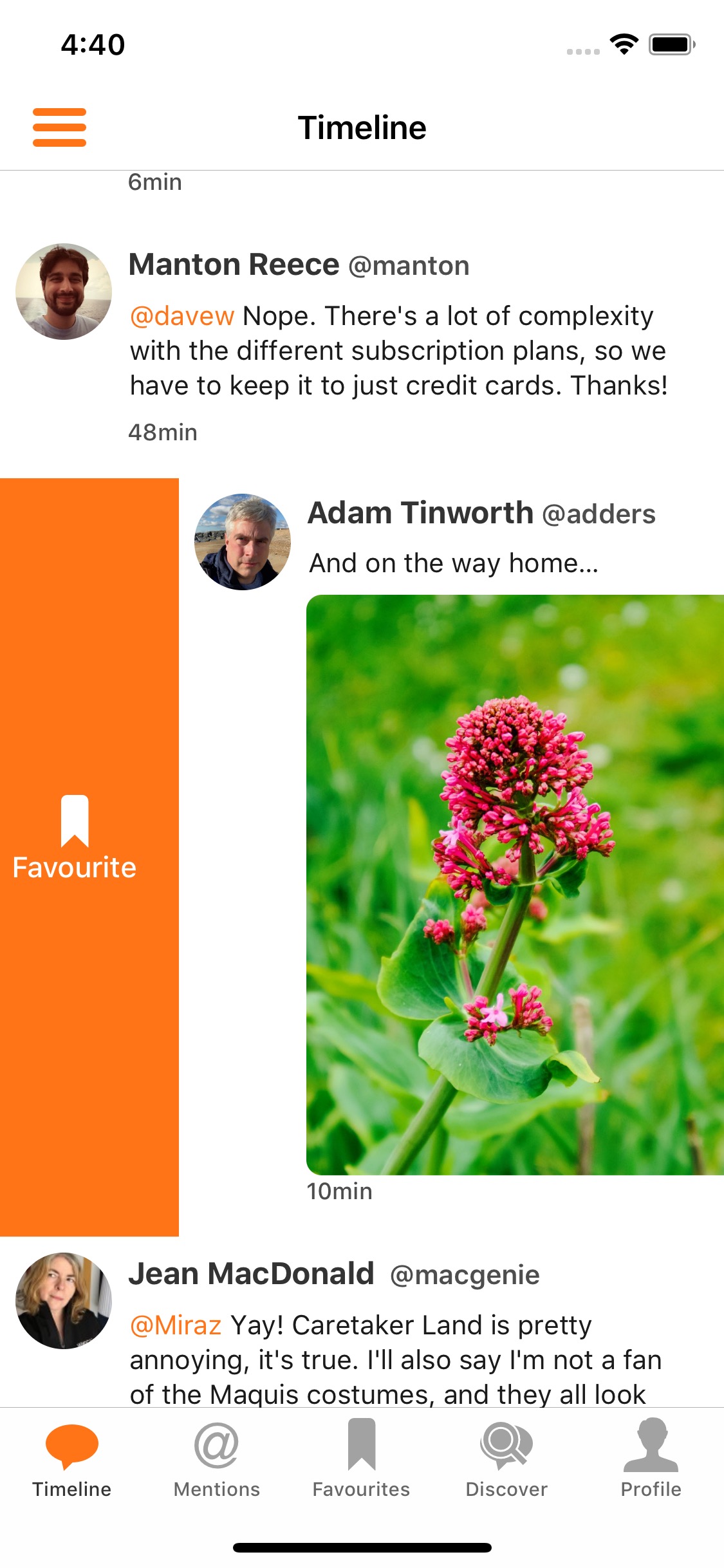
Here’s the favourite swipe action:
I really want to start working on the ability to compose posts in Slate, since it’s one of the last features before it’s functionally complete. However, there are a lot of mini tasks in my list as well. So I think the plan is to have the next version (v0.4) quite a small one, with bug features, design tweaks, etc. And then I can work on composing!
I’ve just come up with a safer way to sign up for the Slate beta. Here’s a simple form to submit your email, and i’ll add it to the list! blog.chrishannah.me/projects/…
Slate v0.3
#It’s time for me to push another beta version of Slate!
Honestly, I didn’t complete everything in my plan for this version. But versions don’t really mean anything at the minute, as it’s probably better for the whole process if I just release more often.
Here’s the raw release notes for this build:
- Added pull to refresh on the profile and author views.
- Profiles and author views now have the name as the title.
- Times on posts are now relative.
- Links are no longer underlined.
- Instead of verifying the app token every time the app is launched, it moves straight to the timeline, and checks in the background.
- There are now no separators in the post tables.
- The light theme is slightly lighter.
- The menu adapts to the theme as well now.
- Fixed the issue where some tables were not getting their background colour changed when a new theme is selected.
- Line height is now slightly bigger.
- You favourite posts now by swiping from left -> right.
Feel free to get in touch about joining the beta, it’s compltely open to everyone.
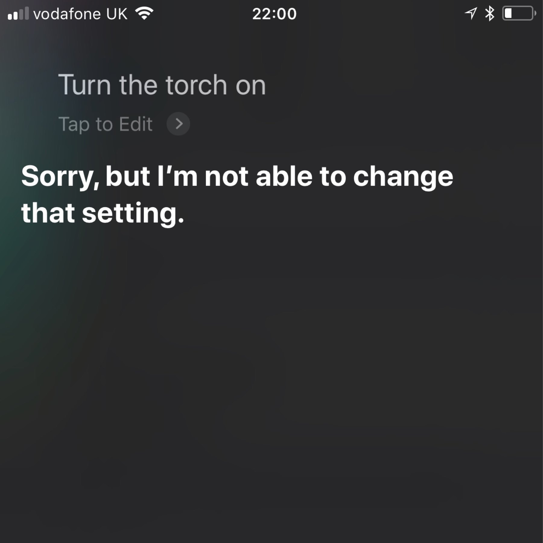
Google Assistant is out there getting its hair cut, and booking restaurant reservations, while Siri isn’t allowes to turn the torch on. That’s a pretty bad sign of over controlling parenting.
Some more design work on Slate!
BBC:
Meet the robots that can pick and plant better than we can
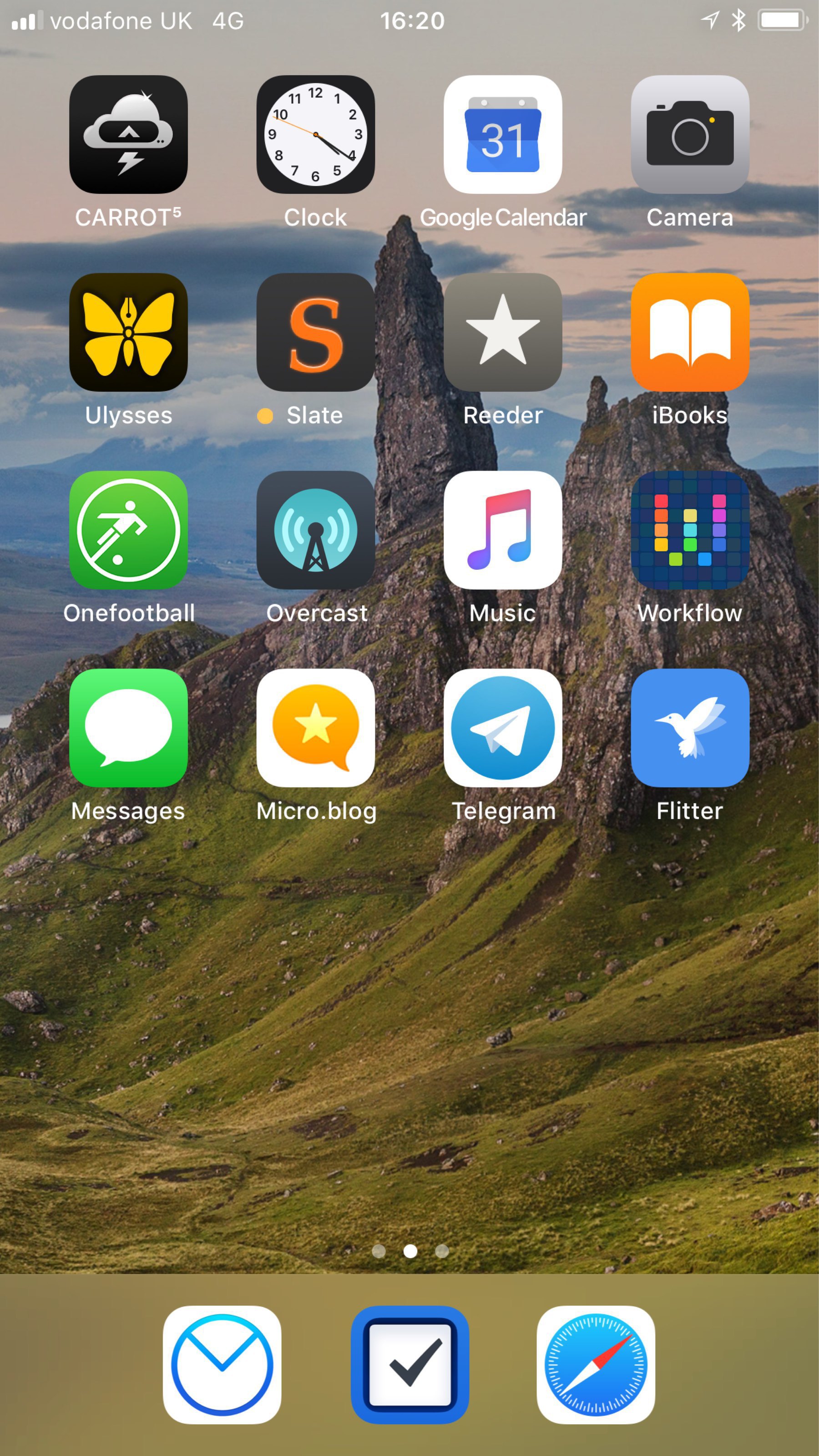
My home screen is looking pretty good at the moment!
Here are the next things I plan to work on for Slate. There’s still a long way to go.
It doesn’t help that I don’t give this project much time.
Icro is certainly very well designed. Which means, I know what I’ll be getting up tonight!
Apple will have to announce quite a lot of new stuff if they want to compete with Google IO. I am extremely jealous.
I just watched the Google I/O 2018 keynote in 14 minutes video from The Verge, and I really wish Google would stop adding great features to Android.
I’m an iOS/Swift developer, I can’t switch!
Localize Your .m Files, For Queen and Country
The island nation of Palau has taken a bold step in a new direction towards conservation: requiring every incoming visitor to sign a stamped pledge in their passports to be good environmental stewards for the duration of their stay.